🎉 Stashable was acquired by MakeSpace in 2019.
Background
Stashable is a full-service storage company, offering pick-up and drop-off of items for people who want to put items into short- or long-term storage. Stashable helps people de-clutter their homes, and make room for new hobbies, dreams, or additions to the family.
Purpose
Belvedere is an internal app for Stashable, primarily for use by Warehouse workers and Drivers, for cataloging and maintaining knowledge of custody of items owned by Customers and stored/maintained by Stashable service.
All employees of the logistics and operations will carry Android devices that allow them to understand the history and importance of every item in the Warehouse.
My role
User research, user flow, wireframes, usability testing, and prototyping.
Design Year: 2018
The roadmap
In order to clearly articulate the product vision, direction and strategy, align the teams and stakeholders on the app’s development, we mapped out the timeline and the features to be expected in different stages of the product.
For version 1.0, we are focusing on the basic functionalities and features:
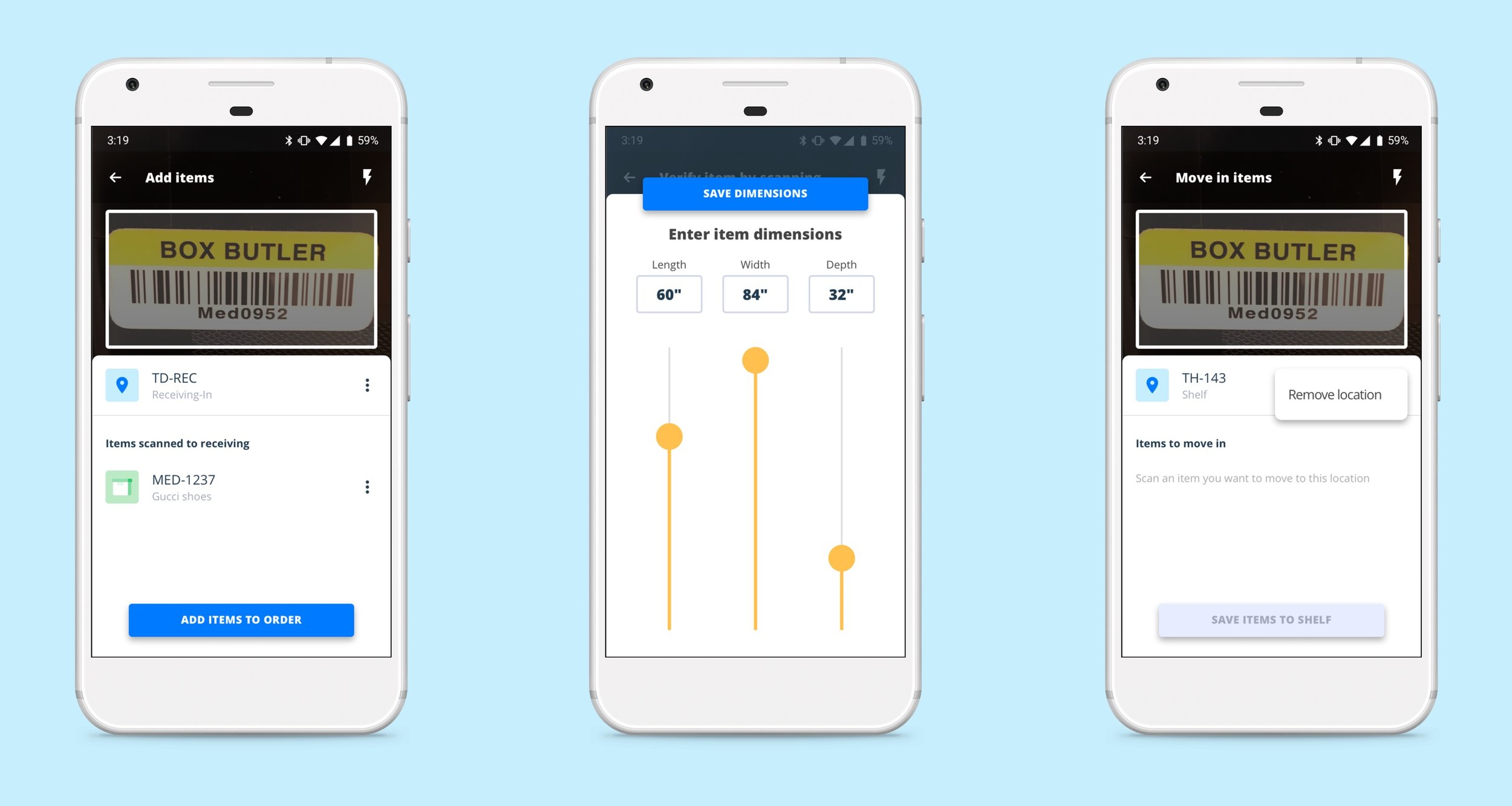
Scanning inventory in to a Warehouse, which includes-
Checking in inventory
Measuring inventory
Moving inventory to a shelf
Adding an item manually
Scanning inventory out of a Warehouse.
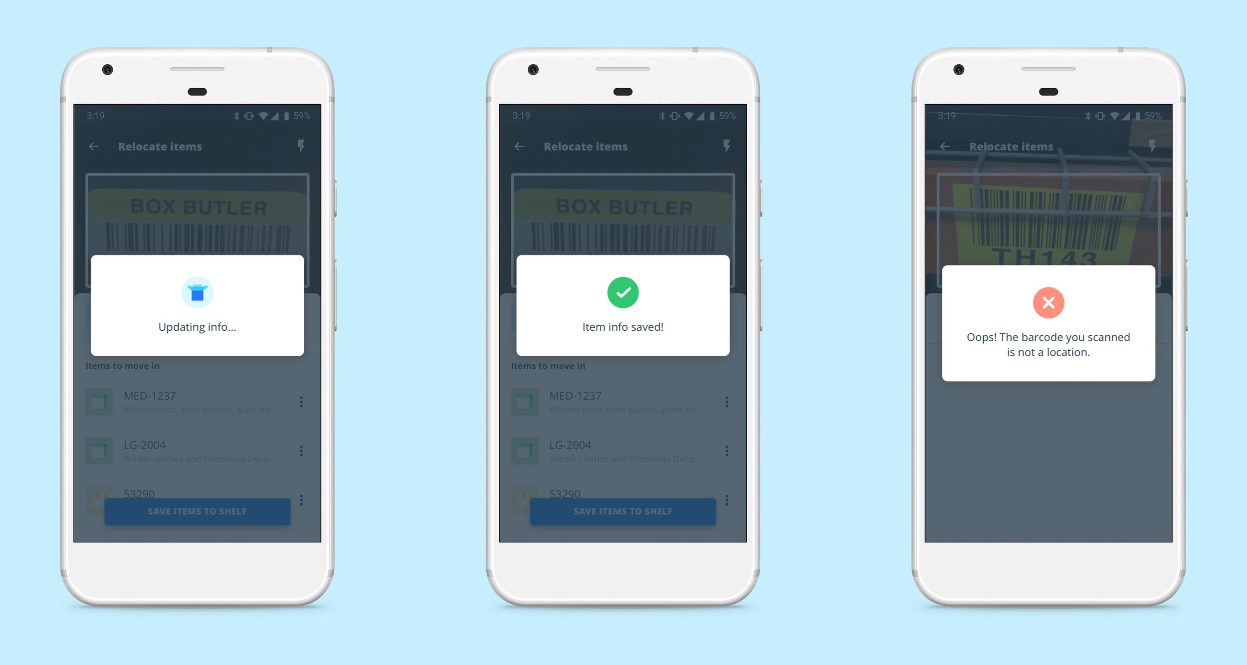
Relocating inventory within the Warehouse.
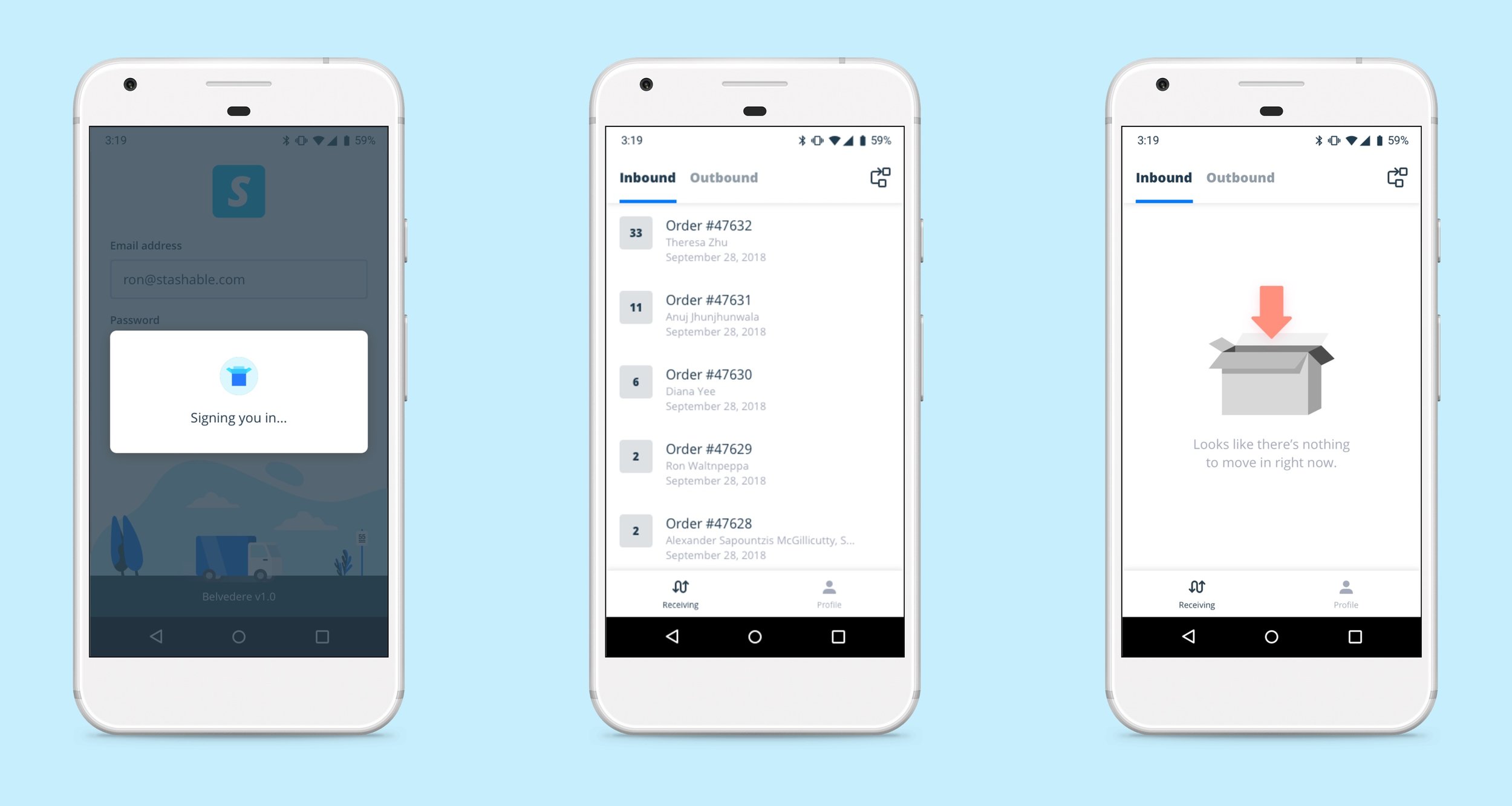
Sign in / Sign out.
Android compatibility
Current expectations is only for devices supporting Google’s fork of Android Oreo (v8.1).
User flows
Breaking it down into smaller pieces
Due to the complexity of building an app from the ground up, and it involves multiplex user flows and requires robust system database support, I started with app mapping and drafting single user flows to have a better picture of the user journey in each logistics.
The big picture
We put together a high-level user journey that includes user interactions in all the flows, and descriptions of back-end data supports, error messages, and verification steps.
Wireframing
Backed by a clear user flow, we were able to think more holistically on the information architecture and user interactions within the app. The problems that we tried to solve were:
1.
A faster and more seamless check-in process.
From the interview with the warehouse, we learned that checking in, measuring, and loading items to shelf are not necessarily by order. The warehouse should be able to move in any item at any time without going into order details which enables a faster and smoother operation.
Solutions:
Enable an "add item" feature during the 3-step process, along with adding a label to the item; the barcode should be automatically associated with the order that it belongs to by database.
Segment the different status even the order is not completely moved in so that the user is able to go back to the order-details screen and resume the process.
2.
A more streamlined measuring and recording process.
What could be a better way for the warehouse staff to input the numbers when they take measurements while holding the device?
Solutions:
Adding number sliders that allow the user to quickly slide to a dimension rather than keying in the numbers.
The range and slide increment are based on the data that we gathered from the warehouse.
3.
A move-out process that communicates with the drivers.
Moving out items by location, and grouping them back by order once they are checked out.
Solutions:
Displaying inventory items in alphanumeric order by location. Automatically sort the items by order once it's scanned out so that drivers are able to load items by order.
UI design
Prototyping
Along with the polished UI design, we created a prototype with integrated animations which provides the engineering team a clearer guide on the interaction details.
Testing and next step
Currently we are developing version 1.0 and continue testing the product with our warehouse staff.


